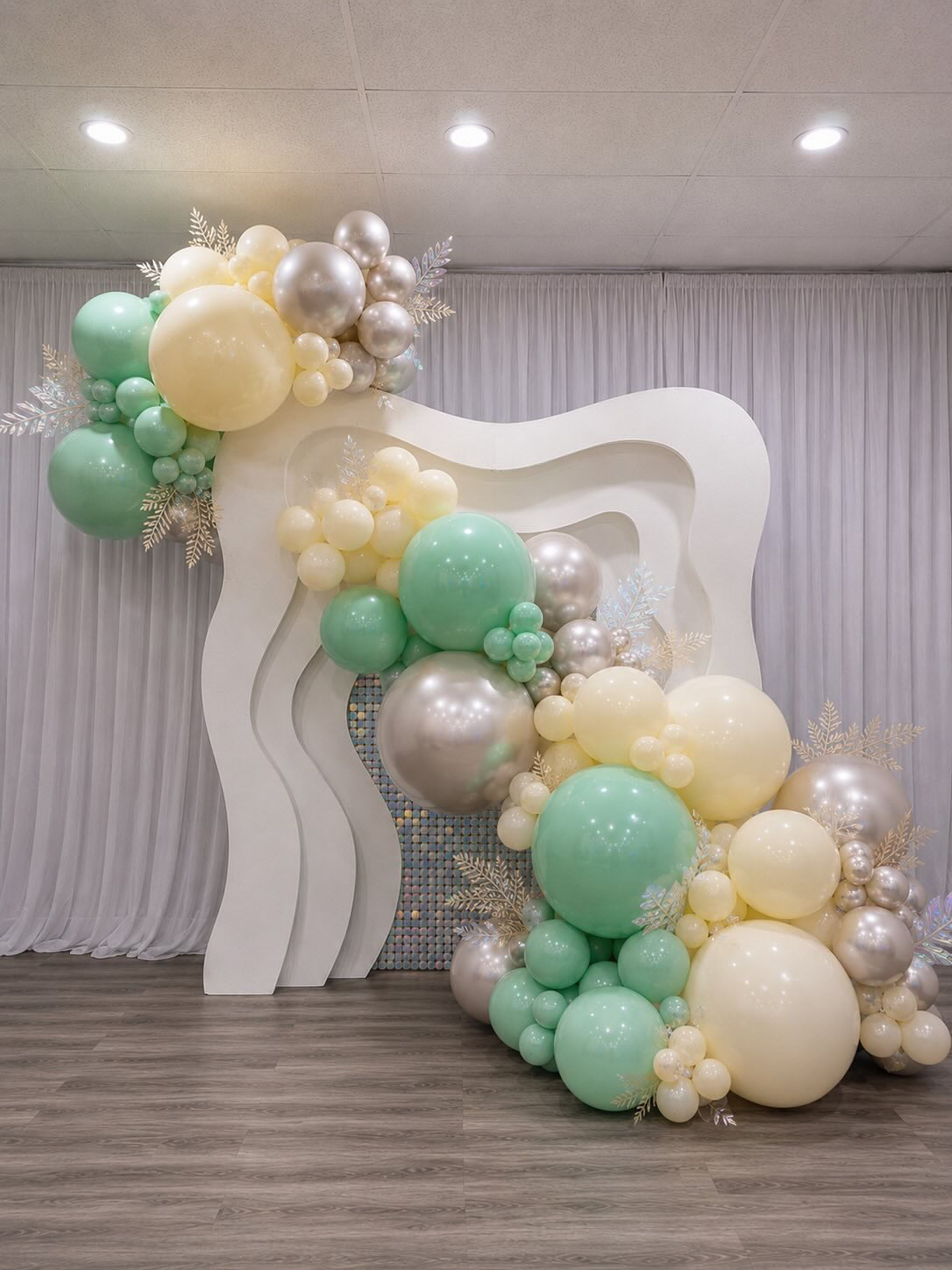
Colour is one of the first elements people notice in a balloon installation. Before guests examine its structure, texture, or individual details, they experience the overall palette and the feeling it creates.
Every celebration is connected to colour in some way. White can suggest a fresh beginning in January, red becomes closely associated with Valentine’s Day, and pastel shades return during spring and Easter. Bright, energetic colours capture the feeling of summer, while fall brings copper, orange, burgundy, and earthy tones. During Christmas, traditional seasonal colours share the stage with elegant metallic finishes.
Colour helps people recognize the season, understand the theme, and connect emotionally with a design.
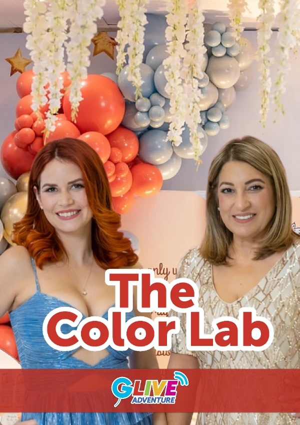
In The Color Lab, part of G-Live Series Season 2: The Designer Effect, Yakelin Ferrer of Yakie Decor explains how decorators can move beyond random colour selection and begin creating intentional, balanced palettes.
Whether you are designing a birthday arrangement, wedding installation, corporate display, or seasonal celebration, understanding colour can help you create more cohesive, memorable, and professional balloon decor.
Prefer to read this article in Spanish? → Explore the Spanish version here.
Why Colour Matters in Balloon Decor
Colour is one of the most influential elements in the design process. It shapes first impressions, communicates emotion, reinforces identity, and can affect how people respond to a product or visual experience.
According to the Pantone Color Institute, colour can increase brand recognition by 87% and influence up to 85% of product purchases.
These figures demonstrate why colour should never be treated as an afterthought. In balloon decoration, the palette is often the first element guests notice and one of the strongest factors in how they interpret the theme and atmosphere of an event. Colour can influence:
- The first impression of an installation.
- The mood and atmosphere of an event.
- How guests recognize the theme.
- Which areas of the design attract the most attention.
- Whether the decor feels playful, elegant, natural, modern, or dramatic.
- How effectively the installation photographs and appears on social media.
- How closely the final result reflects a client’s vision or brand identity.
Colour is not simply added after the structure is complete. It is one of the first creative decisions that gives direction to the entire design.
Discover the New Gemar Colour Legend
To make colour selection easier, Gemar is introducing an updated Colour Legend that provides a clearer way to explore, identify, and communicate its extensive range of balloon colours and finishes.
The new organization divides the Gemar collection into two main groups: CORE and BOLD.
CORE represents classic and versatile colours that can form the foundation of a design. BOLD includes distinctive finishes created to introduce contrast, personality, and visual impact.
Together, these groups help balloon artists, distributors, retailers, and customers choose the right combination for every creative project.
CORE COLOURS
CORE includes Gemar’s classic colour range, organized into three categories.
Basic
Gemar’s standard, traditional balloon colours provide versatile options for birthdays, holidays, corporate events, weddings, and everyday celebrations. These familiar colours can serve as the foundation of a palette or create complete designs with a timeless appearance.
Matte
Natural and Macaron colours feature softer, more subdued finishes. Matte colours work beautifully in organic, romantic, contemporary, and nature-inspired designs. They are especially suitable for baby showers, weddings, garden celebrations, and modern birthday themes.
Super Matte
The new Marshmallow line offers an ultra-soft matte appearance. These colours can give a design a delicate, refined, and contemporary character, making them ideal for decorators who want to create understated installations with a distinctive visual finish.
BOLD COLOURS
BOLD includes Gemar’s most expressive finishes, designed to stand out or introduce a special visual effect.
Metallic
Metallic colours offer a rich appearance that can bring depth, elegance, and sophistication to an installation. They work particularly well in luxury celebrations, fall decor, anniversaries, New Year events, and holiday designs.
Shiny
Shiny colours feature a reflective, glossy finish that interacts with light and attracts attention. They can add glamour, movement, and energy to birthday installations, corporate displays, holiday decor, and statement pieces.
Neon
Neon colours are bright, vibrant, and created to stand out. They are ideal for summer parties, youth celebrations, tropical themes, nighttime events, and installations that need high visual energy.
Crystal
Crystal balloons feature translucent colours that allow light to pass through. They can introduce transparency, lightness, and visual contrast, especially when combined with opaque balloons or used in layered designs.
One Colour Can Create Multiple Effects


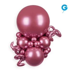
A colour is more than its name. Its finish can completely change the way it appears, feels, and complements a design. Pink, for example, can be presented as:
- A classic Basic colour.
- A soft Matte shade.
- An ultra-soft Super Matte tone.
- An elegant Metallic finish.
- A reflective Shiny colour.
- A vibrant Neon.
- A translucent Crystal balloon.
Although each option belongs to the same general colour family, every finish creates a different result. A Matte pink can feel soft and romantic. A Shiny pink may appear glamorous and energetic. A Metallic pink can introduce sophistication, while a Crystal pink adds transparency and visual lightness.
Gemar’s updated Colour Legend makes these distinctions easier to understand, allowing decorators to select not only the right colour but also the right finish for the desired atmosphere.
Explore Gemar Colours and Finishes
Move from Random Colours to an Intentional Palette
A successful balloon palette is not simply a collection of attractive colours.
The colours must work together, support the theme, and establish a visual hierarchy. When every colour demands the same level of attention, the installation can feel busy or disconnected. Before choosing your balloons, consider:
- What emotion should the design communicate?
- Is the event playful, elegant, romantic, natural, dramatic, or corporate?
- Which colour should guests notice first?
- Does the venue already contain strong colours?
- Are there seasonal, brand, or theme colours that must be included?
- Should the design feel soft and understated or bold and energetic?
- Will the installation be photographed in natural or artificial light?
These questions transform colour selection from guesswork into an intentional part of the design process.
How to Use the 60/30/10 Rule
One of the principles explored in The Color Lab is the 60/30/10 Rule. This guideline helps distribute colours so that each one has a clear role.
60% — The Dominant Colour
The dominant colour establishes the main visual identity and overall mood of the installation. It occupies the largest portion of the design and may be a classic neutral, a seasonal colour, or a bold signature shade.
30% — The Secondary Colour
The secondary colour supports the dominant shade and introduces enough contrast to make the design visually interesting. It should be clearly visible without competing for control of the palette.
10% — The Accent Colour
The accent colour is used in smaller amounts to attract attention and complete the design. It can be introduced through Shiny or Metallic balloons, specialty shapes, small clusters, florals, ribbons, signage, or other decorative details. For example, an elegant fall palette could include:
- 60% warm Matte beige.
- 30% burgundy.
- 10% Metallic copper.
A fresh spring palette might use:
- 60% Super Matte pink.
- 30% Matte light green.
- 10% soft yellow.
The percentages do not need to be mathematically exact. The purpose of the rule is to establish hierarchy and prevent every colour from competing equally.
Find Colour Inspiration throughout the Year
Seasonal colour associations are not strict rules. They provide familiar visual starting points that decorators can personalize through different Gemar colours and finishes.
| Season or Occasion | Colour Inspiration | Suggested Gemar Finishes |
|---|---|---|
| Winter and January | White, silver, ivory and icy blue | Basic, Crystal and Metallic |
| Valentine’s Day | Red, burgundy, pink and blush | Basic, Matte, Metallic and Shiny |
| Spring and Easter | Pastels, lilac, yellow, light blue and soft green | Matte and Super Matte |
| Summer | Yellow, orange, hot pink, turquoise and lime | Basic, Neon and Shiny |
| Fall | Copper, burgundy, terracotta, orange and earth tones | Matte and Metallic |
| Christmas | Red, green, gold, silver and winter white | Basic, Metallic and Shiny |
A decorator can begin with these recognizable references and then adjust the palette to reflect the client, venue, trend, or desired creative style.
Build Seasonal Palettes with CORE and BOLD
The updated Colour Legend makes it easier to combine dependable foundation colours with more expressive accents. For a spring installation, a decorator might use Matte and Super Matte colours from the CORE collection to create a soft foundation, then introduce a small Shiny accent from the BOLD group.
For summer, bright Basic colours can be combined with Neon balloons to increase energy and visibility. A fall palette may combine earthy Matte colours with a limited amount of Metallic copper or gold. For Christmas, traditional Basic red and green can be elevated with Shiny or Metallic accents.
The objective is not to use every finish in one design. Each colour and finish should have a clear purpose within the palette.
Create Your Own Balloon Colour Palette
Use this simple process to turn inspiration into a practical design.
1. Define the Occasion
Identify the type of celebration, season, theme, audience, and desired atmosphere.
2. Select the Dominant Colour
Choose the colour that best communicates the primary mood or identity of the event.
3. Add a Supporting Colour
Select a secondary shade that complements or intentionally contrasts with the dominant colour.
4. Choose an Accent
Introduce a colour or finish that can attract attention in smaller amounts.
5. Select the Finishes
Decide whether each colour should appear as Basic, Matte, Super Matte, Metallic, Shiny, Neon, or Crystal.
6. Test the Combination
Place balloon samples together and observe them under lighting similar to the event environment. Natural light, artificial lighting, photography, and nearby surfaces can all influence how colours and finishes appear.
7. Adjust the Distribution
Use the 60/30/10 principle as a guide. If every colour appears equally dominant, reduce one and allow another to lead the composition.
Turn Colour Inspiration into Balloon Designs with Gemar
Understanding colour theory is the first step. The next is choosing balloon colours and finishes that can translate your creative vision into a real installation.
Gemar’s complete colour collection gives decorators the flexibility to create soft monochromatic arrangements, traditional seasonal palettes, modern tonal designs, and bold high-impact installations.
CORE provides the versatile foundation. BOLD introduces the finish, contrast, and personality that can transform the final result.
Together, they make it easier to find the right colour and visual effect for every celebration.
Shop Gemar Balloons | Explore Gemar Colours
Watch The Color Lab with Yakelin Ferrer
Learning colour theory does not limit creativity. It gives you a stronger foundation for making creative decisions with confidence.
In The Color Lab, Yakelin Ferrer shows decorators how colour can communicate emotion, define a celebration, guide attention, and transform the overall impact of an installation.
Watch the masterclass in G-Live Series Season 2: The Designer Effect and begin creating more intentional balloon palettes.
Watch The Color Lab Masterclass
You can also visit the Gemar Color Inspiration Hub to explore real installations and discover combinations for your next project.
From traditional classics and soft matte shades to expressive Metallics, reflective Shinies, vibrant Neons, and translucent Crystals, Gemar offers a comprehensive collection of colours and finishes to bring every creative vision to life.
 by Cloud Media Pro